Find a Web Designer near you
The average rating for Bark Web Designers is 4.9, based on 699,966 reviews
As technology has advanced over the last decade, web design requirements are quickly evolving. Gone are the days where you could set your website up to be viewed on a desktop and know that it would look the same for every user.
But what is responsive web design and how can you ensure that your website is set up for it? In this article, we’ll tell you everything that you need to know when it comes to responsive web design.
Responsive web design involves utilizing flexible web design tools to create a website that can be viewed on any device. Resolution, image size, and scripting abilities should all be adapted automatically to suit the screen size and device being used.
When you use responsive web design techniques, you are ensuring that your website can be properly viewed, no matter what device is used. This can help to improve customer experience, maximizing engagement with your site and consequently conversion rates.
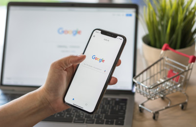
Think about how many different devices you regularly use to browse the internet. The chances are, you don’t just use a computer anymore. In fact, you might even be reading this article on your smartphone or tablet.
Mobile web browsers account for more web traffic than desktop browsers, so it’s important that your website looks fantastic no matter what device users are viewing it on.
However, it would be near-enough impossible to create a different form of your website for every single possible screen resolution and orientation. Think about how many different devices a user could be viewing your website from, including Samsung, iPhone, Kindle, iPad, laptop, desktop. The list goes on.
If you look forward to the next decade, there are likely to be even more advances in technology. Maybe users will even be viewing your website from a smartwatch in the next ten years.
Responsive web design is about creating a website that will automatically adapt to the user’s display, ensuring that it looks just as effective no matter what type of device it’s viewed upon. If you don’t create a responsive website, you risk losing customers who can’t find the information they need.
The first thing to do is to check whether your website design is responsive. To do this, simply try viewing your website across different devices. This should include a range of screen sizes and orientations.
Your website design should adapt automatically to each screen size, with images and content resizing to maximize user experience. You should be able to clearly read all information on every device, and you should be able to click all hyperlinks and buttons.
If your website successfully adjusts to the different screen sizes and resolutions, your website design is responsive. If your website’s aesthetics are affected or content is missing or difficult to read, your web design is not responsive and could be improved by a web designer.
You might have also heard of adaptive web design and be wondering what the difference between responsive and adaptive web design is.
Responsive web design involves creating a single version of your website which automatically adapts to the device that is being used. Adaptive design involves creating several different versions of the same page.
The main benefit of choosing responsive design over adaptive design is longevity. No matter what screen sizes are used in the future, responsive web design will still be relevant as it will automatically render according to the device being used. With adaptive web design, you’ll need to keep creating different versions as new devices and screen sizes become popular.
To create a responsive website, you’ll need to optimize every element of your website, including images, videos, and content. To do this, you’ll need to know how to use a few different coding languages: HTML and CSS are most commonly used for creating responsive websites.
You’ll use this code to add media queries to your site, which adapt the size and resolution of elements within your website to suit the screen size being used.
If you’re new to web design, this isn’t a straightforward task. It’s best to hire a professional to make sure that the task is completed thoroughly and nothing is missed. After all, we know that a responsive web design can help to improve customer experience and in turn, conversion rates.
Hiring a web designer is the most effective way to ensure that your website design is responsive and your prospective customers are seeing the full impact of your website. A professional web designer will make sure that your website is displaying properly on any device so that you don’t lose a single customer due to your web design.
If you’re ready to hire a web designer to make your website fully responsive, you can hire a Web Designer on Bark.
The average rating for Bark Web Designers is 4.9, based on 699,966 reviews
 5/5
5/5
based on 699,966 reviews
Need an expert to help with your social media marketing but not sure how much it’ll set you back? Read on to find out how much a social media marketing agency or freelancer will charge for the management of your social media pages.


 Specialists")


